Wednesday, October 26, 2011

What's what on Jackson street

The gallery map that was originally located on the Hutt Valley Community Arts website has become a main feature of our marketing strategy. The map is no longer electronic, redesigned with the Farsite proposed aesthetic and folded to become a keep sake for the visitor and giving them information of other places to go, along Jackson street.

The map will be located in the all mentioned places, on counters, coffee tables or information stands. It will also be available at the Petone library and information centre. The map is also designed to increase Farsite's exposure to visitors and locals alike.

A key feature of the map is the location system which is colour coded for galleries, cafes and retail stores. To also visually communicate the location of the participating shops will be giving a large numbered, hexagon shaped sticker that is the same in the map document. This will allow the visitor to make the connection between the two.

This map also reinforces the element of community and network which is important to the Farsite brand, as it is interested in what the community is doing.

Website

The proposed website was created with core inspiration taken from the logo and Farsite identity. It is important to maintain a cohesive aesthetic throughout all areas of communication and today more than ever to create a fresh and unique online presence.

The transparent triangular motif has been used throughout the web page and serves to cradle and accentuate each element of information being profiled on each page. The design allows presents information in such a way to create maximum legibility and Impact by using vibrant colourful shapes and balancing this out with large areas of white space. Also when scrolling over each component a transparent colour will appear this serves to inrease user satisfaction with the website and also prompts them to click on the links.

Get there!

Our website Banner includes a photograph of Farsite establishing the location and familiarising visitors to the web page with the look and feel of the gallery itself. We found that a key issue with the Gallery was the lack of visibility due to an obscure location at the end of the alley. A clear contact page with accompanying map clearly details the location of the Gallery, helping community members to find the Gallery and begin viewing great local art.

Linking with the community

A important component of the website is the links page, In this section information can be found about other galleries within the wellington community that are working with Farsite to increase art exposure amongst the wider community, as well as gallery reviews and links to interviews with upcoming exhibiting artists.

Get connected

A key feature of the gallery website is the mailing list. Inviting visitors to the webpage to sign up to receive monthly information as well as the gallery Brochure directly to their inbox, sustainable choice that enables up to the minute information about what’s happening at Farsite.


write up for dossier, Ivan may want to double check it covers everything


Tuesday, October 25, 2011

Final brochure, folds in 3


Was an option, now redundant, thought I'd post it anyway.... Images were getting cut by the fold


websss


_ green highlights when u move cursor over b&w images (above^)


Saturday, October 22, 2011

Brochure updates


Bella has put together these variations on layout of the front..


and ...


and the back looking roughly like this ..


We have repeated some info in the copy that needs to be replaced but the general layout is set, I think it looks good having images In black and white as it is consistent with our other collateral and also allows more focus to fall on the coloured shapes. However it does mean we are changing the original art work that Farsite would be exhibiting and perhaps detract from the artwork that is ACTUALLY showing at the gallery . whats is everyones thoughts on this?

Marketing Strategy- draft


A base for marketing strategy, with the sticker/gallery mile idea can be added in to this as it is another form of promo, sorry i tried to upload as an attachment but can't figure out how to do this! hopefully it is still readable.

Thursday, October 20, 2011

To do/check list

Website - showing how it works, what the linked pages look like etc

Signage - Windows, sign on Jackson st, desk and wall + how are we going to show this, line drawings or photoshop
+
Mural - Whats happening with this?

Business cards
+ Stationary - stock?
Email signature
Letter head

Map - Need more places + sticker printed

Brochure - b/w or colour images?

I think thats it?

PROPOSAL TIME

Saturday, October 15, 2011

Another idea...

map


Cover design for the gallery mile map.
Content includes map of Jackson Street and great places to visit, into sections, eg, food, second hand shops, galleries, interesting places to visit etc.

The places shown on the map will also have a sticker in their window to advise visitors the connection between the map and the store.


Friday, October 14, 2011

Ideas for a banner for the website w/ a photo of Farsite


Another idea... 


Possibility for the other side, with or without the logo.... I'm assuming the gallery would probably want to have the logo obviously used on the card

Back of Business card

Idea for having 4 different backs of the business cards, same pattern but looking at it more of less zoomed in. Then the other side would be the same for all

Initial business card stuff, with old colour, moved on since here but thought I should post it anyway

Idea for signage

With the photos we had of the gallery and its existing signage I realised it was going to be really hard to photoshop it out as well as combat the reflections you get on the windows so I thought using line drawing in the space we want to change could be a good idea, thoughts?

Tuesday, October 4, 2011

Brochure


hey All,

here is the first draft of the brochure. The size would be half an a4, ( two could be printed on a4 = minimal cost for Farsites relative low budget.

The layout is simple, this would be the inside 3 spreads. The first two i have used are my friends art and I wrote a wee blurb on them as hypothetical exhibitions in future.


I thought it was best to keep the grid simple and have a designated template with a place for text, photo and titles/captions so Farsite staff would not have to hire a designer every time they want to release a new brochure..
....the colors could be changed according to season. e.g.( this on would be spring season- green palette representing spring/ new growth etc. ).. summer could be more vibrant warm( yellows,oranges, reds.) ??

I havent ever taken Type so please let me know how dreadful it is ( what needs to change etc...

Poster

Poster Concept, Developing an identity for exhibition like Nick K's lecture, colours could change depending on exhibition

YO,

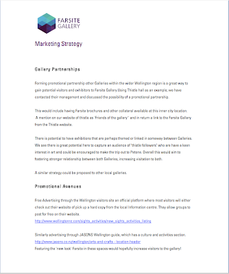
I contacted Jane who runs Thistle hall, I thought we could look into a the possibilities surrounding a partnership where we promoted Thistle hall and they did the same too Farsite- as both galleries are community based/have similar practices. She was open to any ideas we have. I suggested we could spread the word about Farsite by possibly having pamphlets in house at thistle//posters on there window etc. as well as a mention on our website of thistle as 'friends of the gallery'' and that perhaps they could do the same on the Thistle website... anyone got any ideas to add??

Also I looked into simple promotional avenues. An obvious one for me is to Advertise through the Wellignton visitors site, basically they let you post for free on their website-

They are also responsible for those What's on Wellington monthly pamphlets- Featuring the 'new look' Farsite in these spaces would hopefully increase visitors to the gallery!!

There are other promotional brochures we could look into- things like Jasons Wellington guide which has a culture and activities section. although these would have a fee, im not sure how big ,( am enquiring). Basically most visitors pick up one of these, so would be great to have Farsite In this.

Alice

Monday, October 3, 2011

Working with gallery map, Really think if we are going to break up the logo we should get a system of how to do it maybe? so it will look the same on all deliverables.


Hue/saturation changes for the logo

Just some hue/saturation play around for the logo to brighten up the colour, I am drawn to the blue/purple one myself and working with it to make the gallery mile map and some posters for around wellington.

Sunday, October 2, 2011

Design philosophy: Update for Karl, Anna and Katrin

I thought I'd take a moment to explain our reasons for the design of the logo....

From the presentation we've continued our exploration of emergence philosophy and also influence from strong geometric shapes. Emergence philosophy describes the occurrence of "the whole is greater than the sum of its parts"(Aristotle) . We felt that this is the perfect analogy for community. A community brings together a variety of people to create something entirely new.
That is why our logo is made of smaller parts, triangles, which when out together make something else, a hexagon. You can look at it as one shape or many, also having a 3D effect by making a cube, a space which like the gallery is essentially a box.
With our other deliverables we have been breaking apart the logo (examples to come) experimenting with colour and shape achieved by rearrangement.

Watch this space!

Re look at logo

Katrin pointed out the spacing of 'gallery' was making it float away a bit, so I pushed it together a little and tightened the leading so the 2 words were closer so more joined. I think the bottom left one works quite well, the bolder text stands out more and gives the logo a more dynamic shape than just a horizontal or a vertically aligned one.